Layout Design for the Krishnakriti Festival 2019 Catalogue was a lateral project carried out for a period of nine months of the greater graduation project for UG programme, communication design, NID done in Krishnakriti Foundation, Hyderabad under the mentorship of Mr. Abeer Gupta.
A heartfelt thanks to Abhijith KR for insights on publication and graphic design on the Krishnakriti Festival 2019 catalogue and festival executive summary.
The Krishnakriti Foundation holds an Art and heritage festival—the Krishnakriti Festival every year. While the festival report, documents the interaction of people with the events in the festival, the festival catalogue showcases all the original artworks, contemporary and archival photographs with archival maps.
The 2019 festival consisted of exhibitions, film screenings, workshops, presentations, symposium, performances, heritage walks and school outreach programmes. The festival catalogue is a representation of the festival in the form of a publication. It is designed as document to convey the idea of the festival, and the particulars of every event that happened in the festival.
Detailed out below is the order in which this publication was compiled along with the process of the compilation and gives a view on how the layout design was done to showcase the vast textual content and visual material in synergy.
Designing this catalogue required a thorough study of different publication works. Some books were referred for composition, and layout purposes while others were referred for the specifics of catalogue formats which are described further in this sub-section.
The Alkazi collection and Nauras formed the main sources of references for the size and treatment for layouting of archival content.
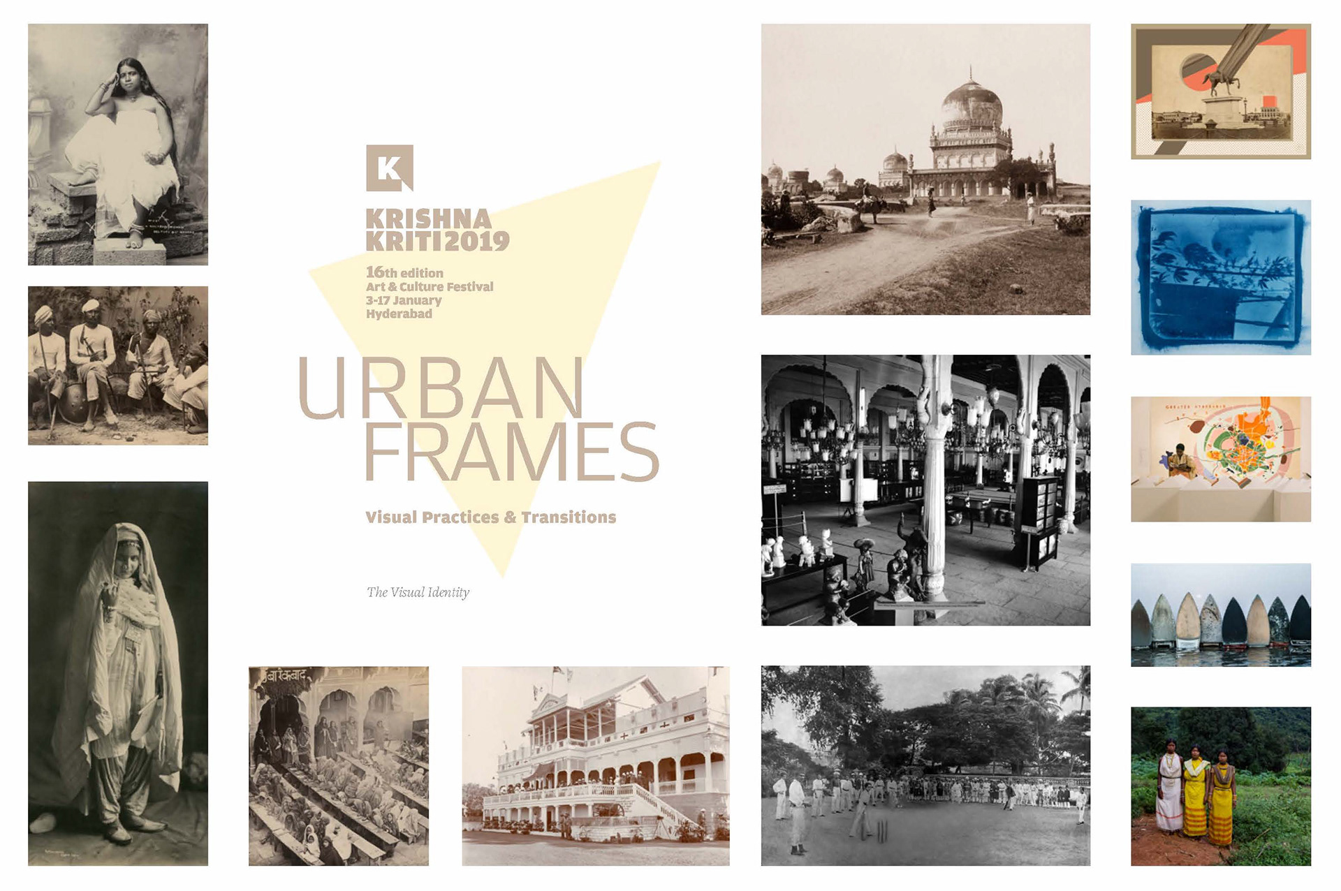
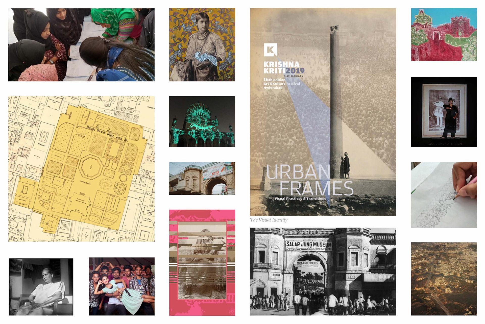
Engaging with festival theme, content and branding
The initial step was understanding the theme, branding and the different events happened in the festival. Engaging with this material gives an idea about the compilation to be done in the publication and helped taking forward the thoughts on layout design of the catalogue.
The visual material is provided by the festival curator and archivists while the textual material is provided by the content writers and curators of the respective events in the festival.
The festival consisted of exhibitions, workshops, performances, heritage walks, symposiums and film screenings. The catalogue was to be a publication where all the artworks, archival photographs and photographs taken in these events are placed in a order, to get a clear idea of these events.
Page Layout and Typography
Visualising the segregated material
The material is segregated and given by the festival curator. The greater division is made based on the type of material and event, and is numbered numerically as 1,2,3,4 and so on. The main sections contain sub-sections which are indicated by adding a point after the main sections. For example, the different exhibitions within the main section of exhibition is numbered as 1.1, 1.2, 1.3 and so on. The further division within these sections are indicated by adding a point further after the previous point. For example, the exhibitions Spectacular have sub-sections within. Thus, they are numbered as 1.1.1, 1.1.2, 1.1.3 and so on. Once the segregation and numbering is finalised, this hierarchy in section numbers is brought out visually with variation in font weight and size.
Main Section
The font size is kept the largest for the main section. The colour used is the darkest tone of sepia as compares to the sub and sub-sub section.
Sub section
The font size is reduced to half to that of the main section and tint of the colour. The three elements ‘1’, ‘.’, and ‘2’ used different weights to balance the form thickness.
Sub-sub section
The font size is the smallest and the font weight is the lightest for denoting this section.
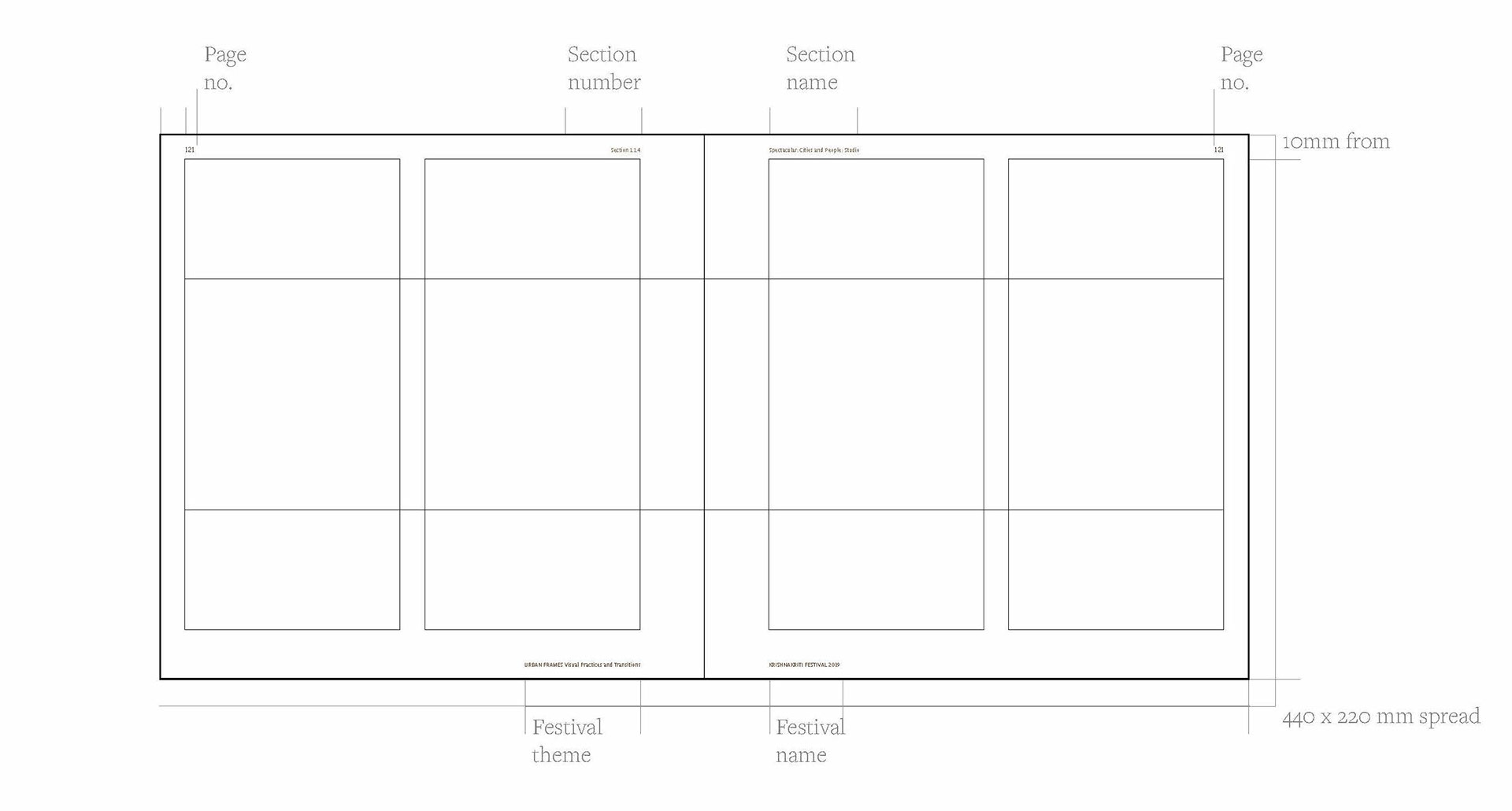
Basic page layout
The margins for the broader layout are 10mm from top and edges and 20 mm from the bottom. The headers consists of three layers of primary information, the section name, numbers and page numbers. Section numbers are aligned to the inside of the margin of the left page and section name is aligned to the inside margin of the right page. The page numbers are a part of the headers and are aligned to the outside margins of the respective pages. The footers consist of the secondary information like the festival theme on the left page aligned to the inside margin and the festival name on the right page aligned to the inside margin.
Sections
The sepia colour derived from the identity used on the complete page with reduced opacity, with the image in the background of Ritual bathers at the Mahamaham Tank, Kumbakonam, which is also used in the visual identity of the festival. This image is repeated on the main sections, 1, 2, 3, 4, 5 and 6
Sub Section
The sepia colour with reduced opacity continues to be used here with addition of another element, a triangle, inspired from the background form of the visual identity for the festival. Being a sub-section, a representative image of the particular exhibition/ workshop is used.
Sub-sub Section
Along with the scheme above, the area outside the triangle is kept completely opaque to signify the place of hierarchy of this section.
Consulting different artists for representing their exhibition displays in the catalogue
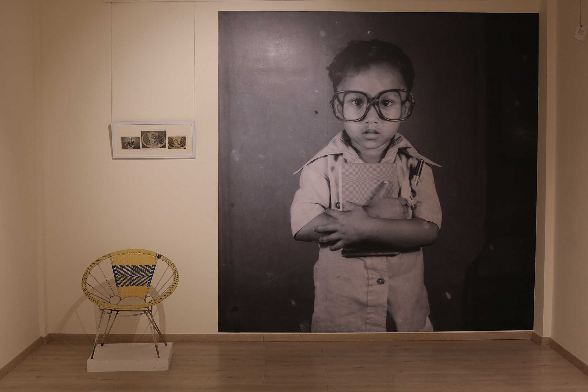
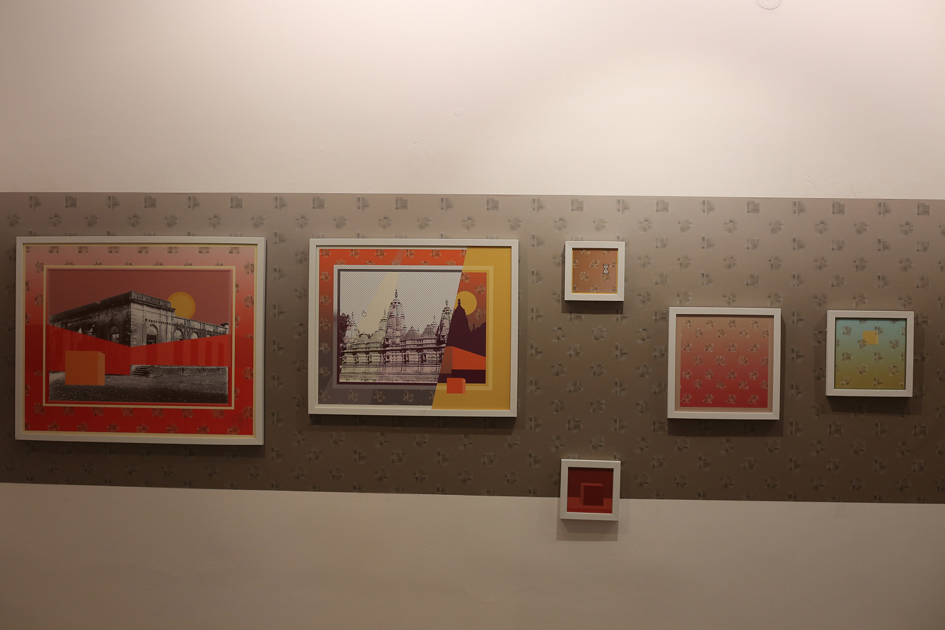
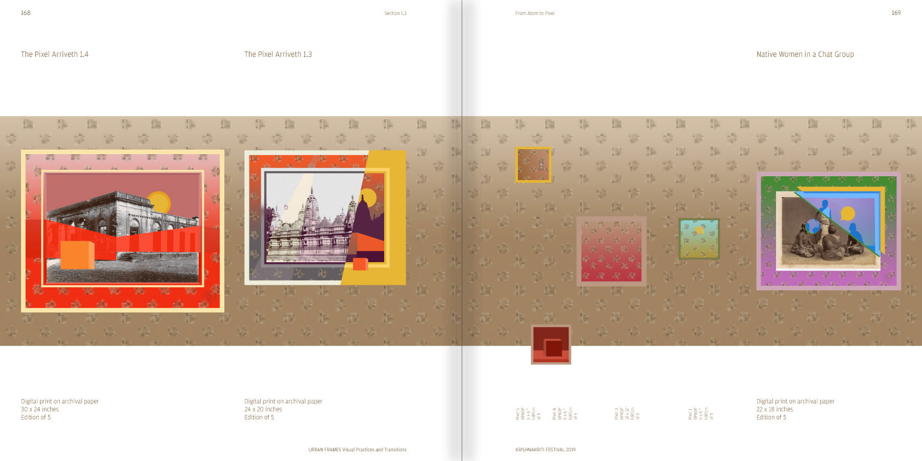
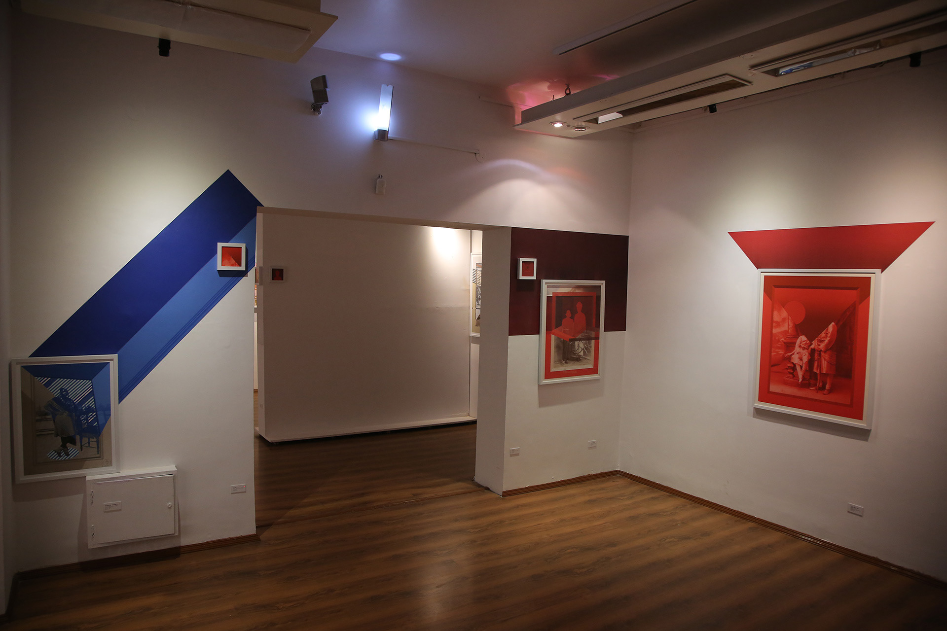
Three artists are consulted, Nandan Ghiya, Ravikanth Masuram and Sameer Tawade. The layouts for these section aim to represent the physical exhibition display.
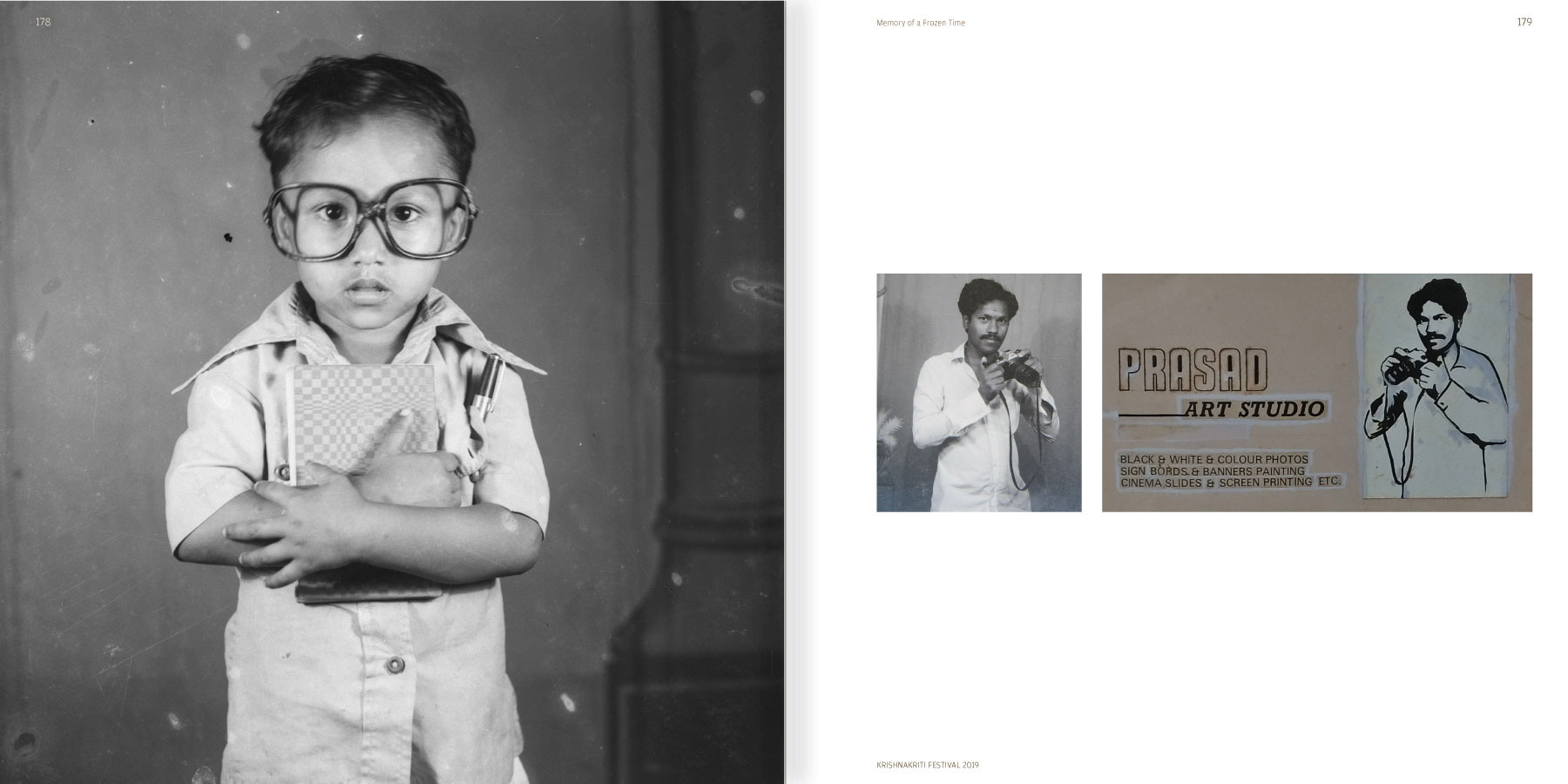
The images on the left are of the exhibition display while those on the right are the layouts designed for the catalogue.
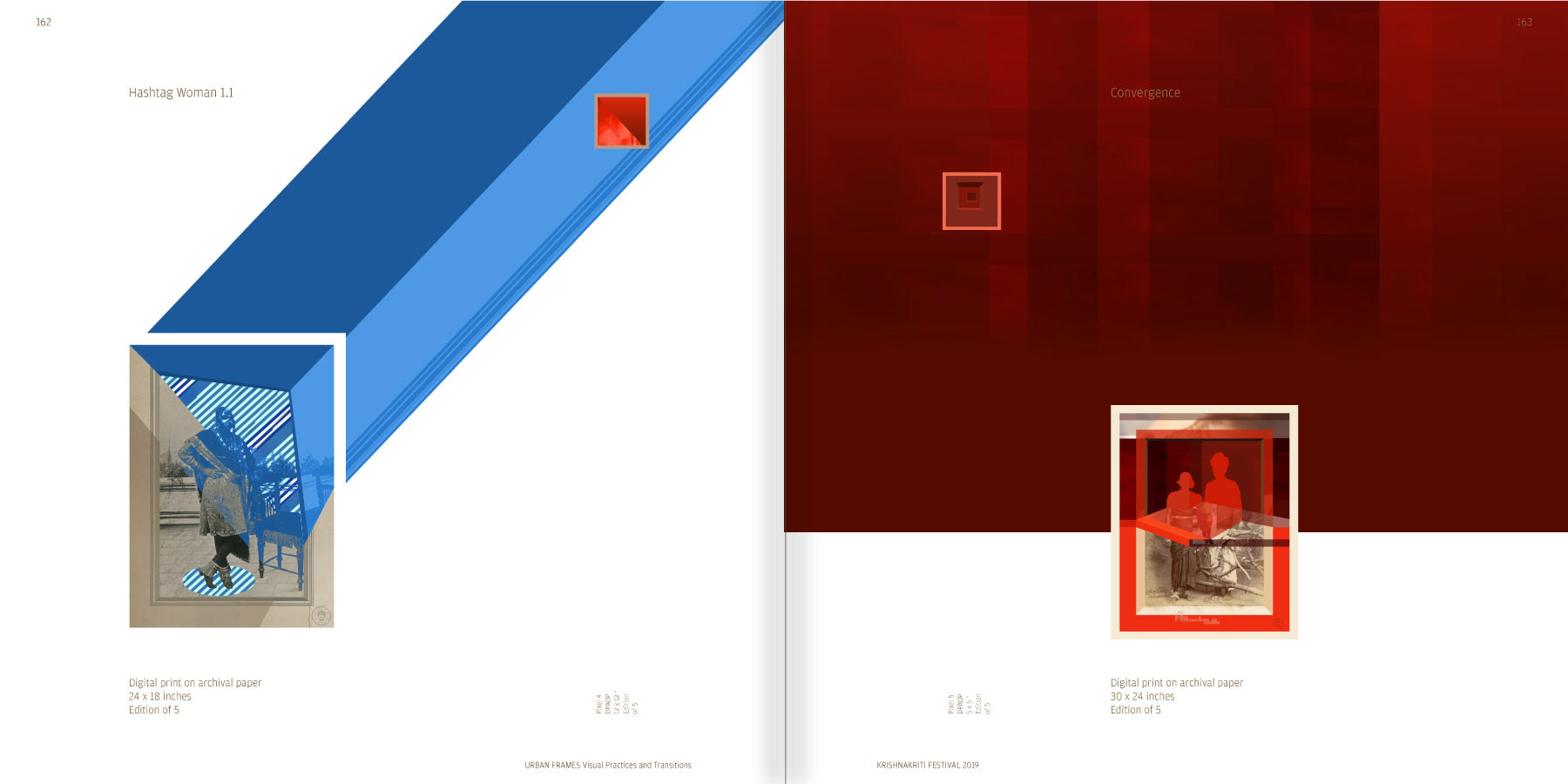
Different layouts within the grid
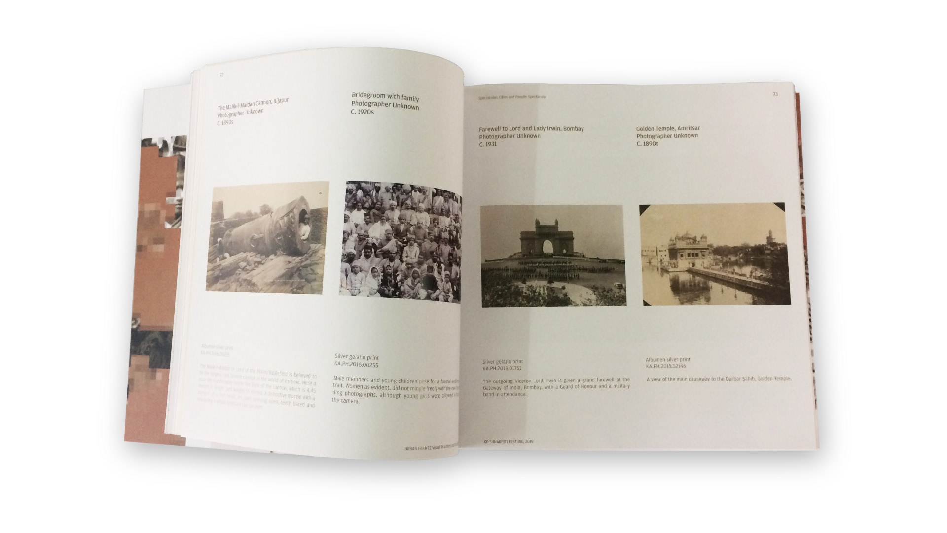
Two landscapes in a spread
Two landscape oriented images occupy a page each and provide with a visual continuity throughout the spread.
One landscape blowup and one portrait blow up in a spread
The captions and descriptions are similar in the horizontal alignment for landscape-oriented images, for instances of occurrence of a portrait-oriented image blown-up on the facing page.
Research Projects: Mapping Dewan Deodi
This section is the first instance where the composition of the text and image is changed within the layout. To keep a legible magnifation to view the areas within the maps, they are blown up and aligned to the left margin and the textual content appears on the right with equal distance from the maps. A common horizontal alignment for captions and descriptions is found after laying out all the content. This scheme is followed throughout this section.
Research Projects: Ahmedabad Walls and Hyderabad Biophilia
The images are aligned to the center of their respective captions and descriptions and this page is the first instance where only text appears on a page. This text block is centre aligned to acquire space dedicated for images.
The text description for this particular part of this section is divided in two columns. The text being more in quantity flows to the second column.
Design for publication cover
After designing the catalogue, there was a familiarity with the festival theme and the content in the catalogue. Designing a cover page for the catalogue was important as it was going to be a representation of the content inside. Different cover types are referred, from similar publications containing archival photographs, like the Alkazi publications: The Waterhouse Albums.
A cover-cum-jacket is thought to be beneficial as the textual content about the festival could fit on the flaps.
The textual content to appear on the jacket-cover is ‘About Krishnakriti Foundation’ in 120-130 words and the festival theme in 60-70 words.
Thus the book cover has three parts, The front cover, back cover and flaps.
Now that the size was finalised, there were four canvases available, to experiment and create a story.
1) The front cover
2) Inside front flap
3) Back cover
4) Inside back flap
Initial option considered for the cover page is a collage of different artworks and photographs taken from the events in the festival.
Another option was to feature artwork from one artist, as a symbolic representation for this publication. The artworks of Nandan Ghiya used for the exhibition are referred and studied. The Photograph Performance Troupe and the artwork of artist Nandan Ghiya based on photograph is finalised to be used to create compositions.
Front and Back
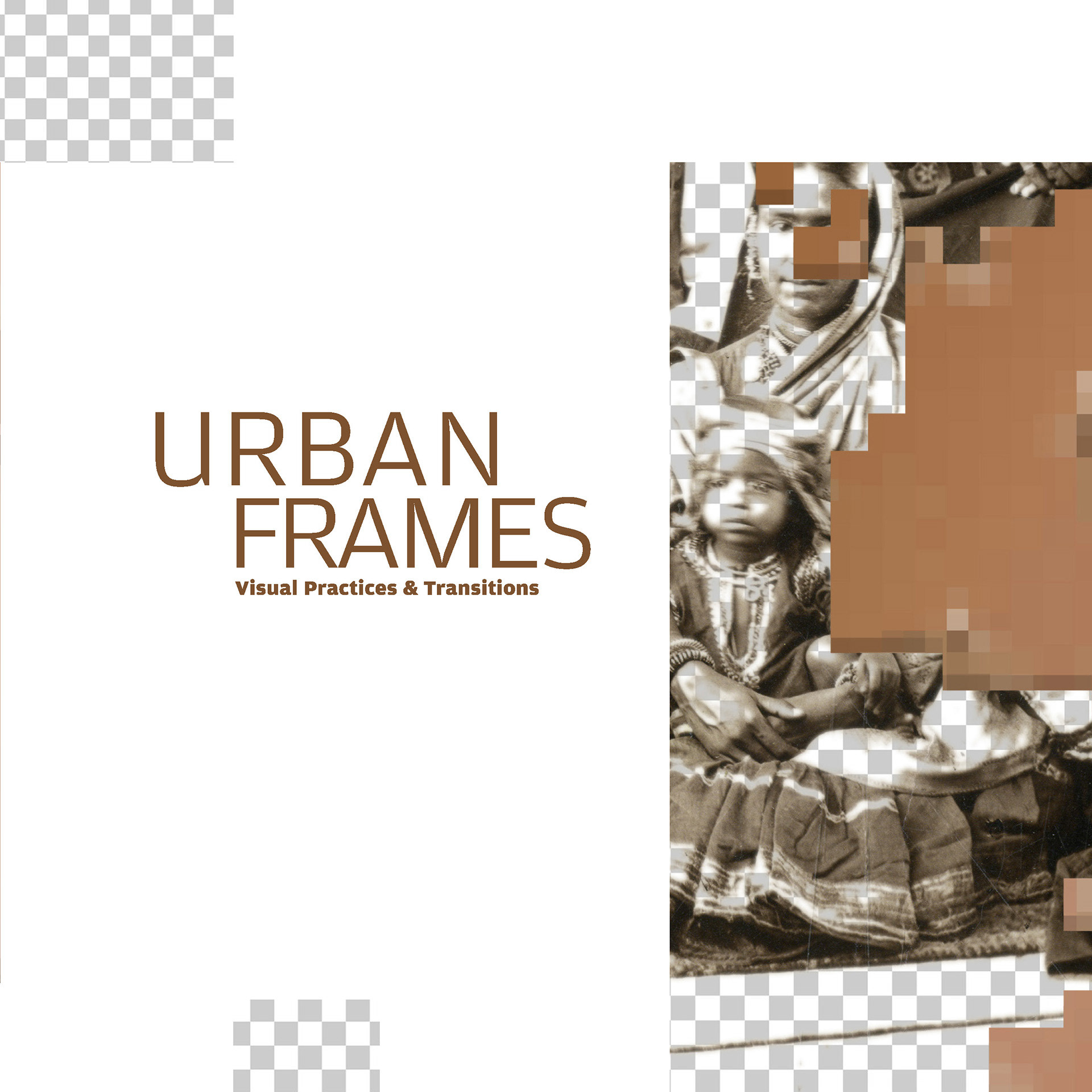
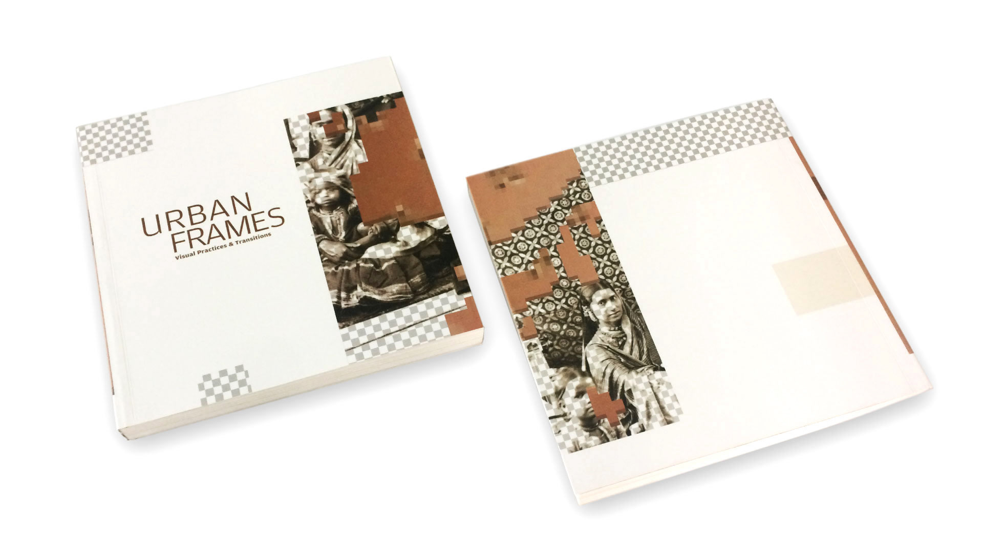
The finalised cover divides the artwork into parts and uses it on the different spaces on the cover to create an interactive visual composition as the various parts of the cover are viewed along with the flaps. The top left corner has a pixelated rectangle, which appears again in the back cover. Elements from the artwork are distributed and form continuous motifs aligned through the front and back cover.
Flaps
The textual content on the flaps is bottom aligned to the page and sit on the bottom margin.
Printed copy images
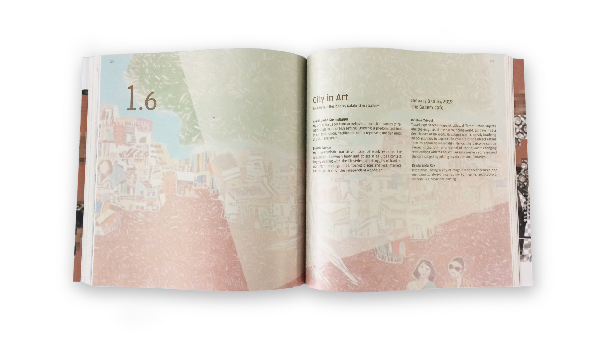
Learnings
The catalogue provided with a exposure to the publication design process from pre-production to print and production. The process of creating a festival catalogue. The basics of layout, typography and image text treatment is learnt. To design a publication containing archival images helped in learning the certain set norms of image layouting, captioning and image descriptions.
As the festival was an collaborative effort of the archival material from the Kalakriti Archives, walk curations from Hyderabad Walks, it was learnt that how these ventures work together, towards creating a festival.
The design for this publication also helped in other lateral projects like branding for Krishnakriti Festival 2020. Studying the visual identity of this festival helped creating the visual identity of the Krishnakriti festival 2020.
While compiling the catalogue, a vast material on history and heritage was explored and engaged with. It was understood that one of the research projects in the festival, Mapping Dewan Deodi is a project which helped in creating the 'City walks', one of the walk category in Hyderabad Walks. The festival branding was an example of visual design done for history, heritage and art.

