
About Vernissage
Vernissage is a periodical publication that talks about all the ventures of Kalakriti India. This publication showcases the updates of these different ventures and the section details out the opportunity to brand for this publication. The section shows the logo and layout design for this publication.
The magazine is edited by Mr. Martand Badoni. Design direction by Mr. Abeer Gupta, director, Krishnakriti Foundation.
Logo Design
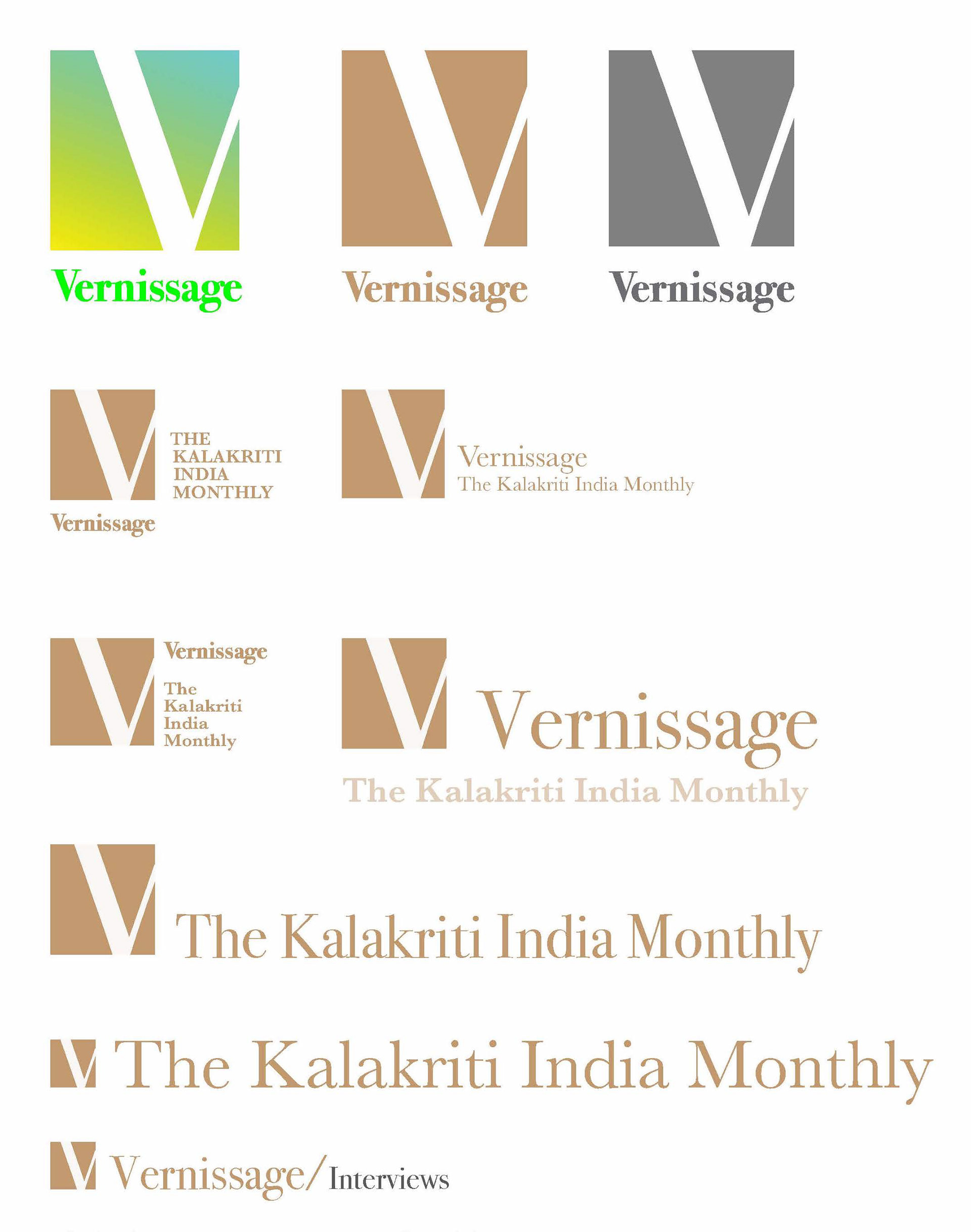
Understanding Vernissage:
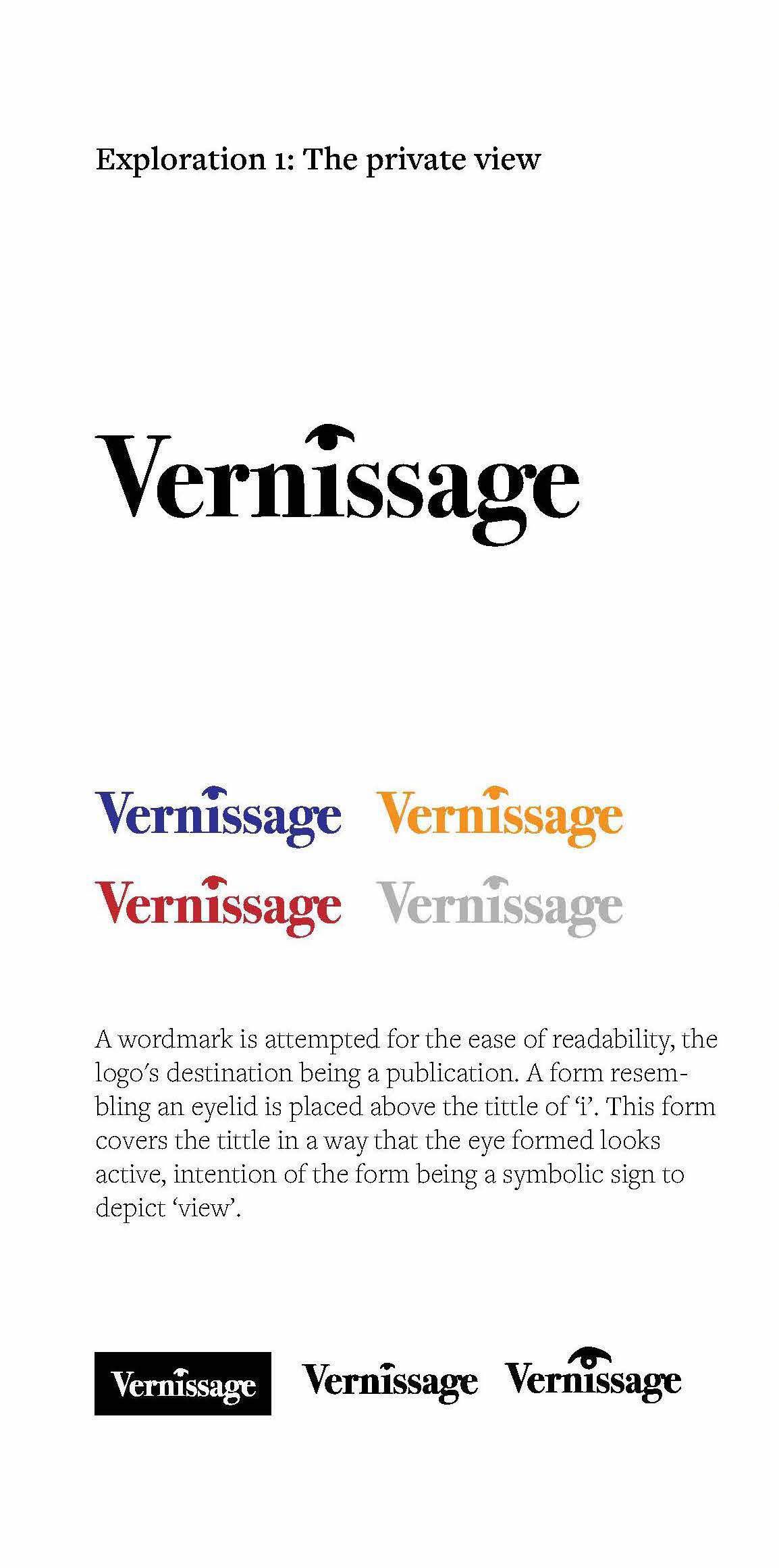
The name vernissage in French means a private view/ screening, a preview of an art exhibition held in private before the public opening. This gives a sense of emphasised importance to the user. Thus the visual identity is explored based on this information.
Doodles:
The magazine logo needed to be visually clear, interactive, and suit the formats of a printed publication. A few compositions are explored using the words ‘art’, ‘exclusive’, ‘preview’ and ‘exhibition’.
Finalised logo
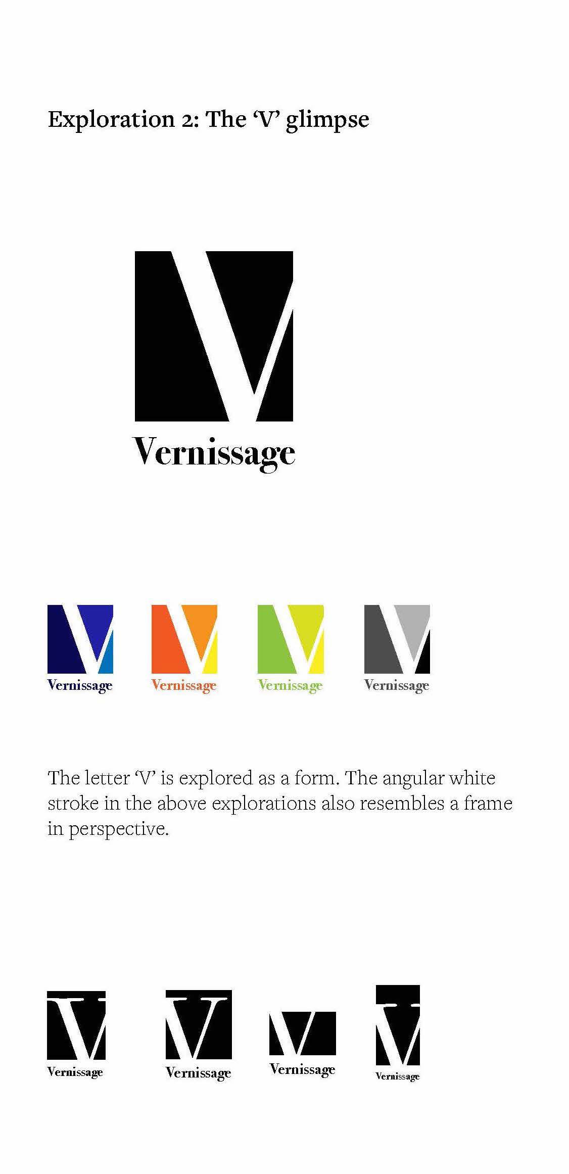
Exploration 2, 'The 'V' glimpse' is finalised by the client. This exploration is fine tuned by finding a balance in the negative spaces and equalising the distance of the stem of the V from the top and bottom edges.
Colours
The primary colour of the logo is thought to be a mixture of gold and sepia to represent the organisations involvement with archival material and also give a contemporary look. The other colour iterations for the logo are adaptive and change according to the content appearing in the publication.
Composing the logo with the name and strapline
The logo is also composed with the name and the strapline in an orientation to suit headers, footers and other potential places where the logo would appear in the publication.

Dummy Layouts
The main contents page
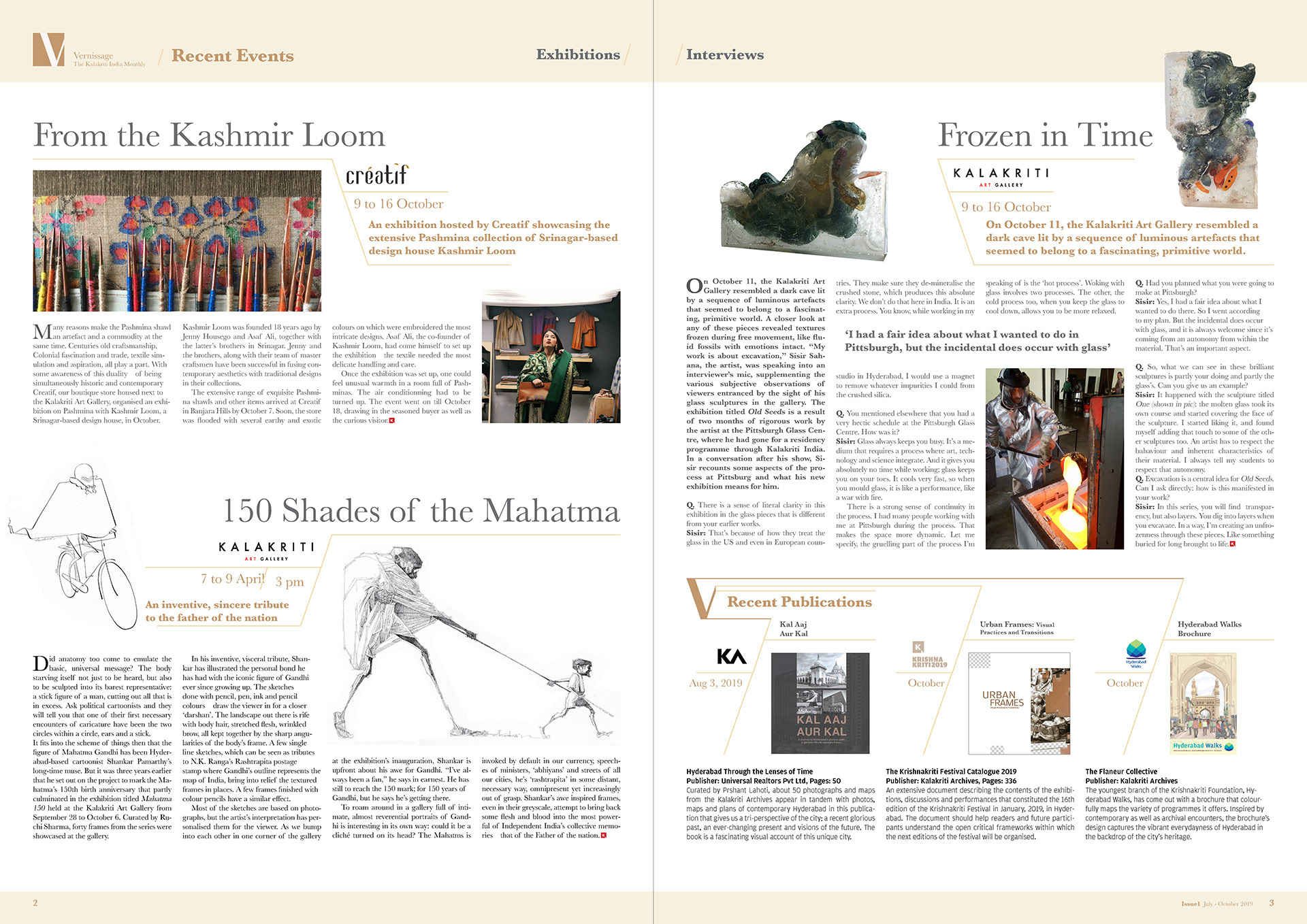
These explorations are done using dummy text and images. The 'V' graphic is further explored to interact with the images and text. The composition uses the images to emerge from the 'V' graphic and place the titles on it.
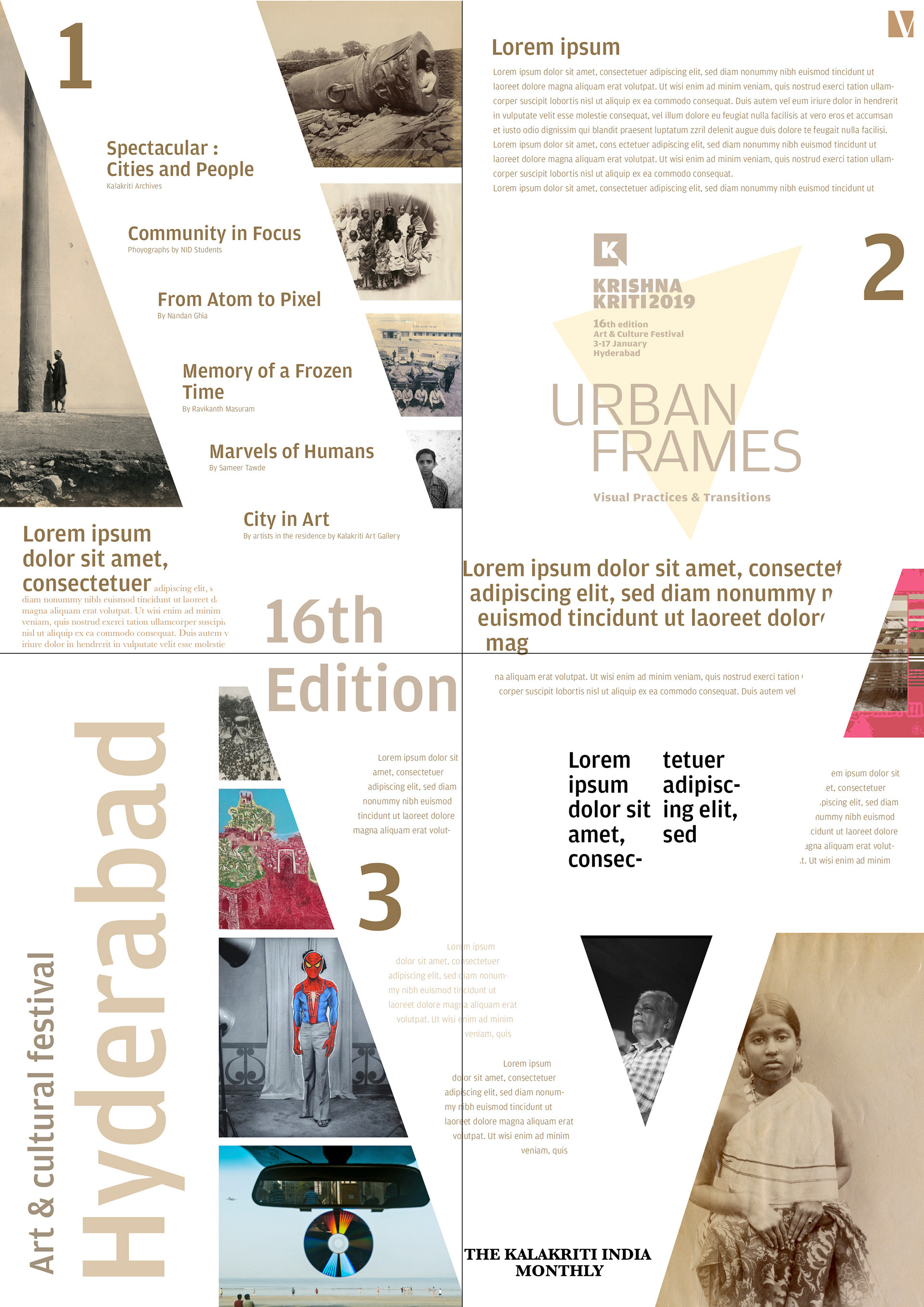
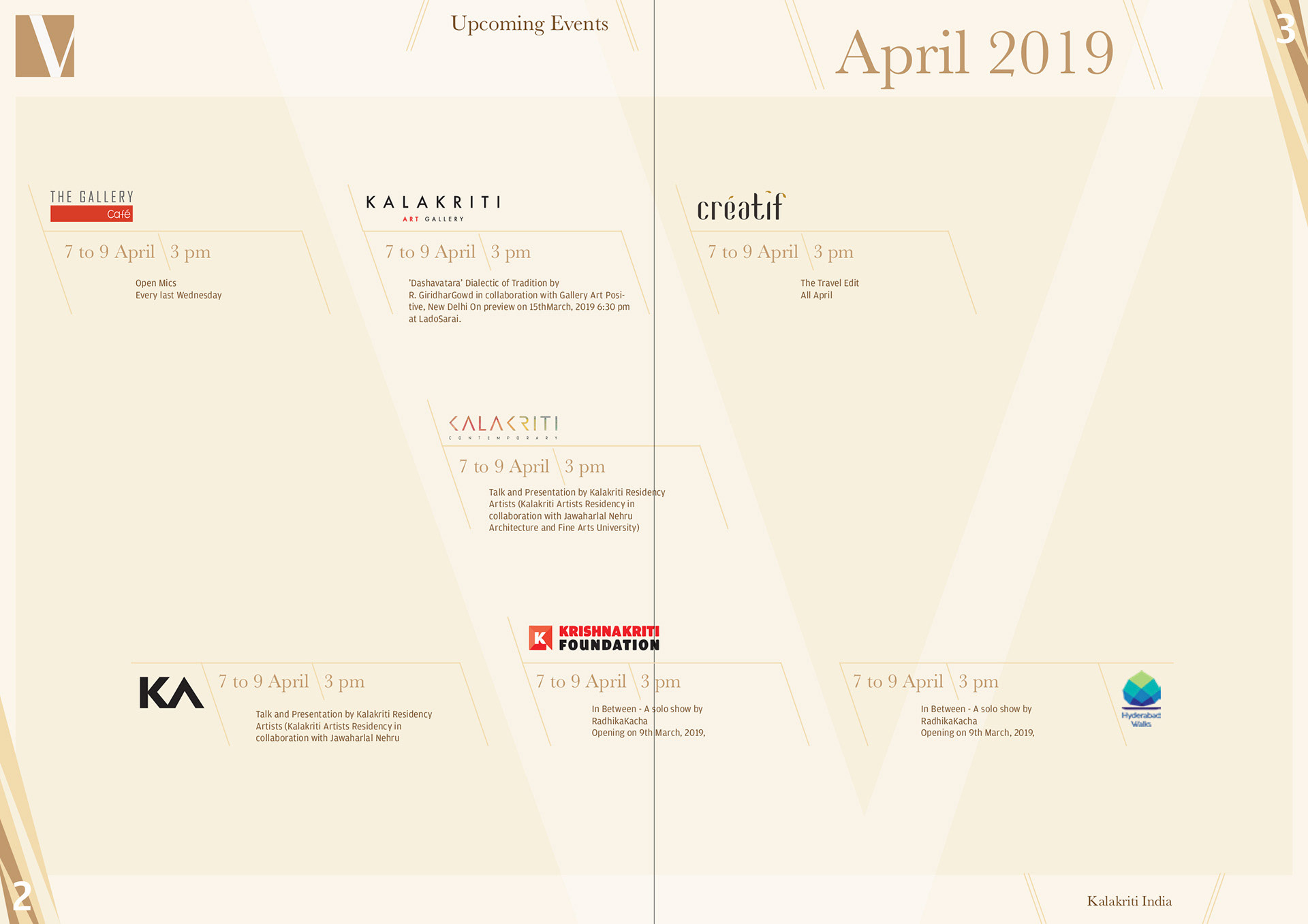
Future events page
This composition explores further graphics inspired from the 'V' element. The slant lines around the logos and textual content have the same angle as the stem of the 'V' graphic. These lines help in sectioning the different ventures of Kalakriti India and the information within, like the event name, venue, time and description.
Layout with content
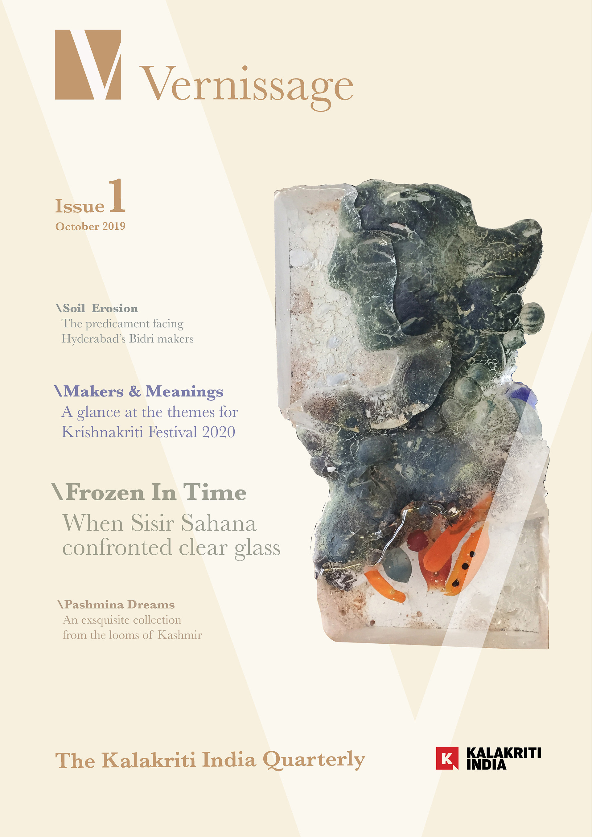
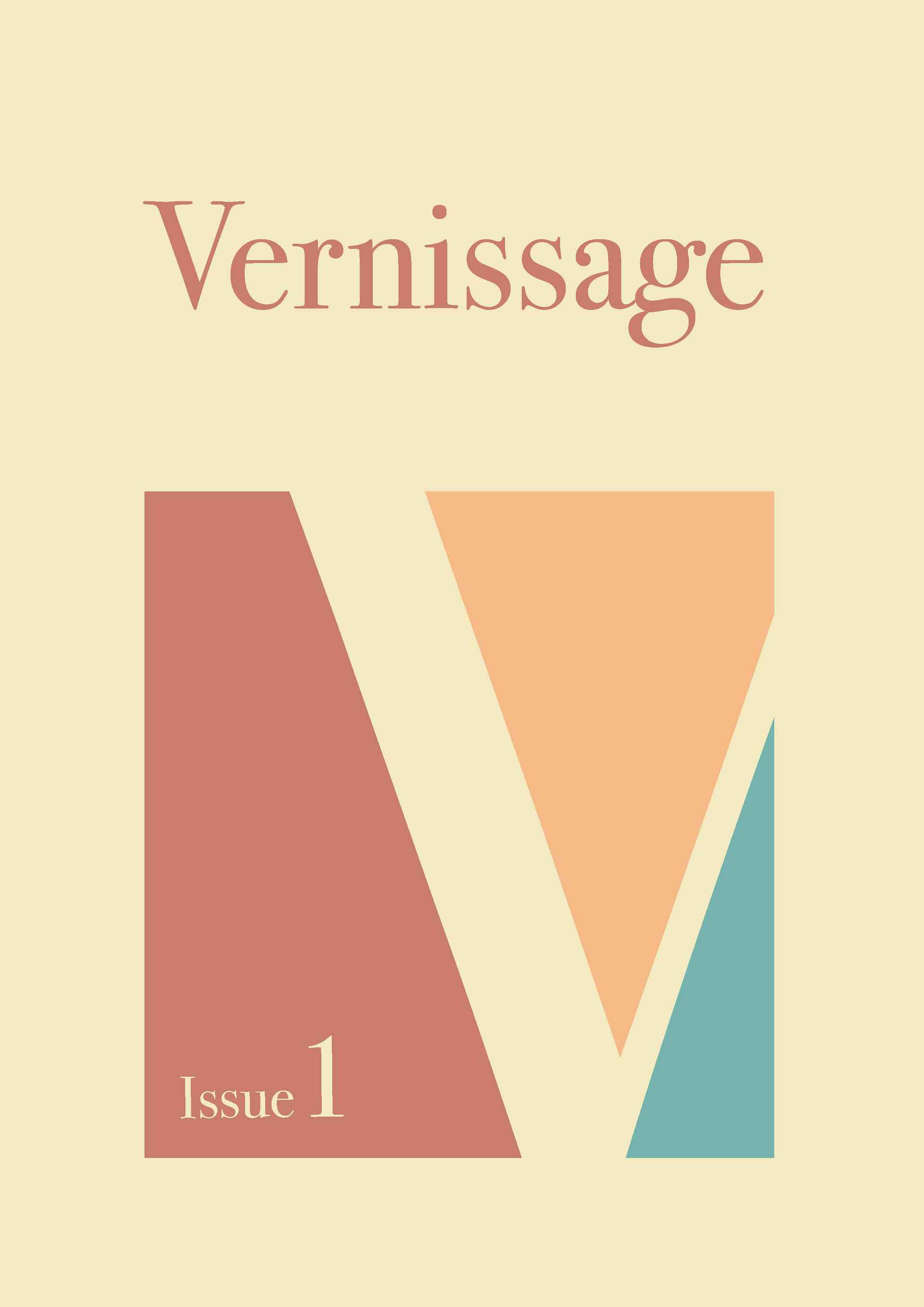
Cover Page
Considering that this is the first publication by Kalakriti India, the cover page is thought to be more introductory and something that would establish the visual tone and language of this publication.
An artwork from an ongoing exhibition in the month of October is blown up on the cover page. This exhibition is chosen as the featured material of this issue. The artwork has an abstract face, looking at the left, thus it is composed on the right for the visual balance and breathing space on the left. The ‘V’ graphic on the page interacts with this artwork by embracing it, with the element on the left behind it and element on the right going above it also giving a depth to the layout.
The textual content related to Vernissage is the 'issue', 'month', and the tag-line ‘Kalakriti India Quarterly’. All appear in the same colour as the identity. Aligned to the tag-line is the organisation logo, placed in the bottom right corner.
Main Content pages
This layout does not have the ‘V’ graphic in the background as the design gets restrictive. It tries to compile the content in the angular lines similar to the angle of the 'V', explored in the previous dummy layout.
Finalised Layout
Cover Page
The cover page for the finalised layout has the Vernissage logo with the different colours for the negative spaces created alongside the 'V' graphic. These different colours are inspired from the artworks featured in the issue. The issue number appears in the bottom left of this logo for a visual balance with the wordmark.
Main Content pages
For keeping the design without restriction and also incorporate the 'V' graphic, a midway is found between the first dummy exploration and Layout with content. The content is divided into categories and each category has an introduction page that features an artwork or a photograph of an article in the section. The 'V' graphic is composed to acquire the complete spread. This photograph is composed to completely acquire the left element of the 'V' graphic. On this left element, the category name is used, aligned to which on the facing page is the right element of the 'V', below which the introduction of the section is placed. This introduction is enclosed in a box with cuts on the top and bottom lines of the box to continue to incorporate the right 'V' element.
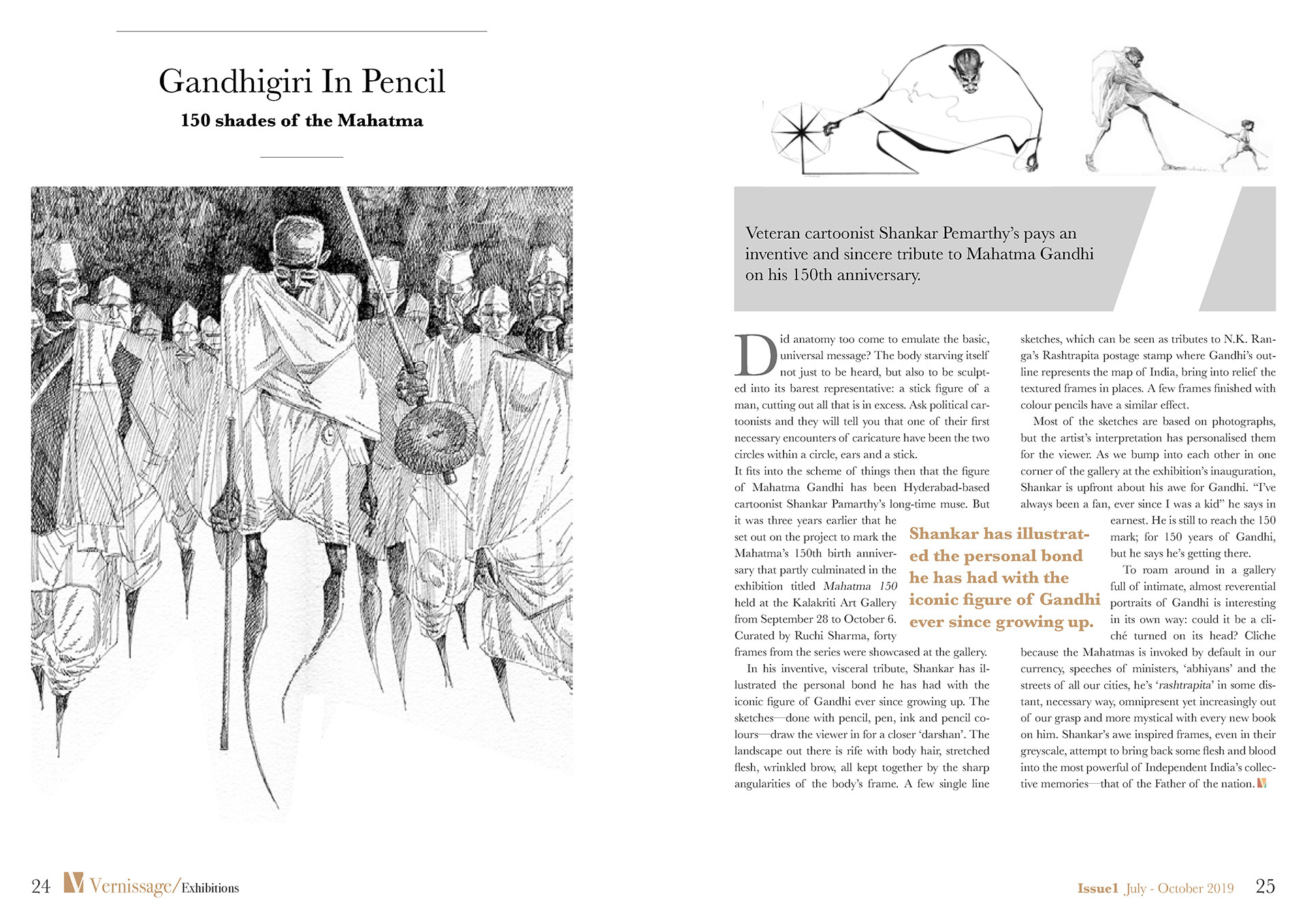
Article page
Starting on the left page, the article is introduced with the article name, subtitle and blow up of the image below. The page on the right has the right element of the 'V' graphic.
The introduction line of the article is given on the page on the right, where the The right element of the 'V' acts a negative.
The design for the logo and the branding was extended through visual design in the layout. The implementation of the letter ‘V’ across the spread made it restrictive for textual content and images to be placed in the layout, but finally a form using negative spaces was found. A knowledge is gained in structuring information for a magazine and bringing out the hierarchy in the structure visually.
Publication design layout terminologies specific to magazines, like 'Category slug', 'Headline', 'Article', 'Introduction', 'Blurb', 'Caption and Kicker', etc. are understood and experimented with.
This project helped in understanding events that happened in the organisation in the year 2019 while compiling the content for the publication. The venture description page helped in understanding how to club the different ventures of an organisation, on a page with synergy. It was a learning on developing the visual language for a platform that talks about different ventures of a head organisation.